


A Current Beneath Structure
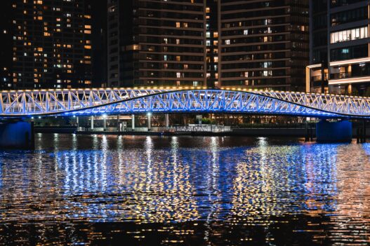
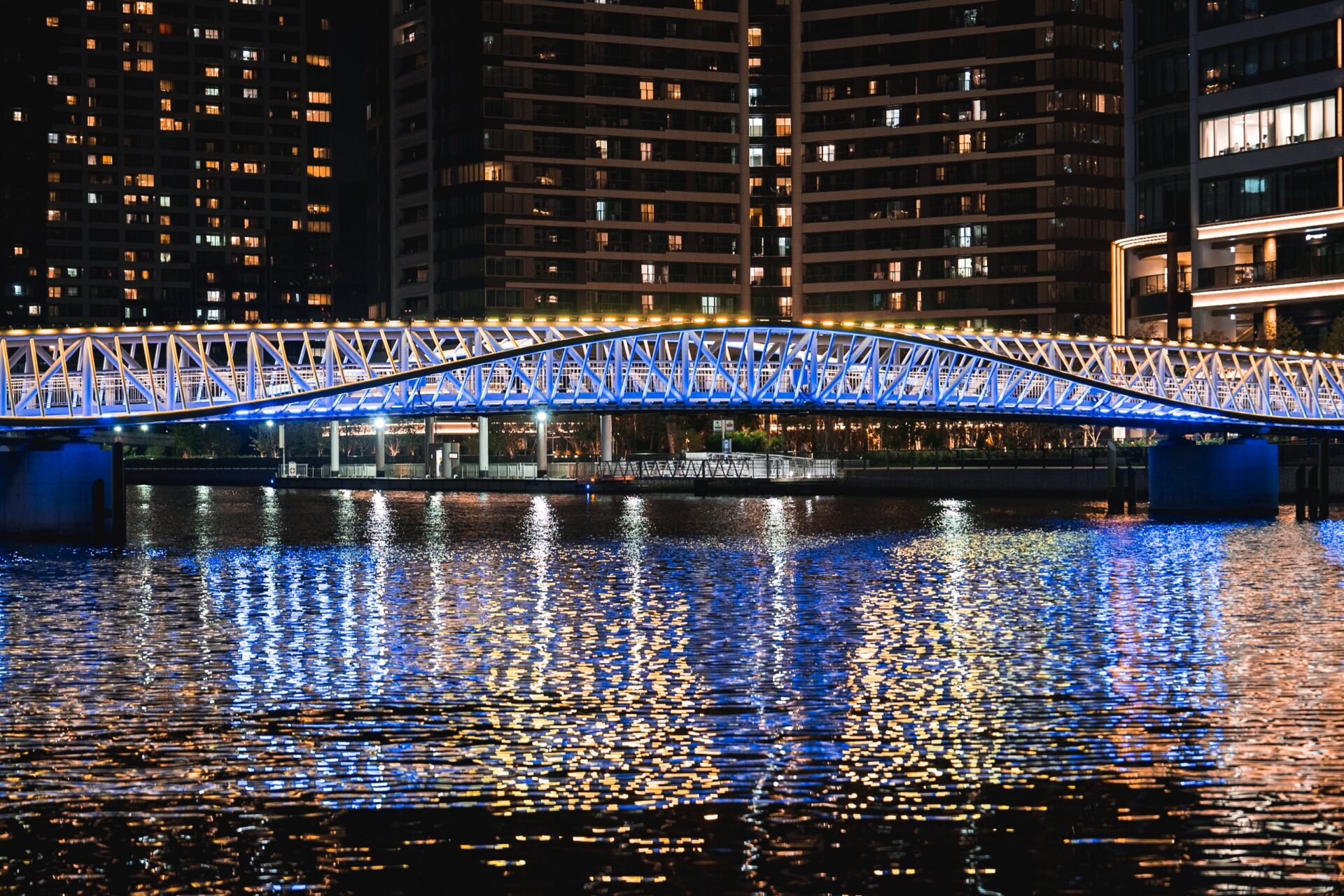
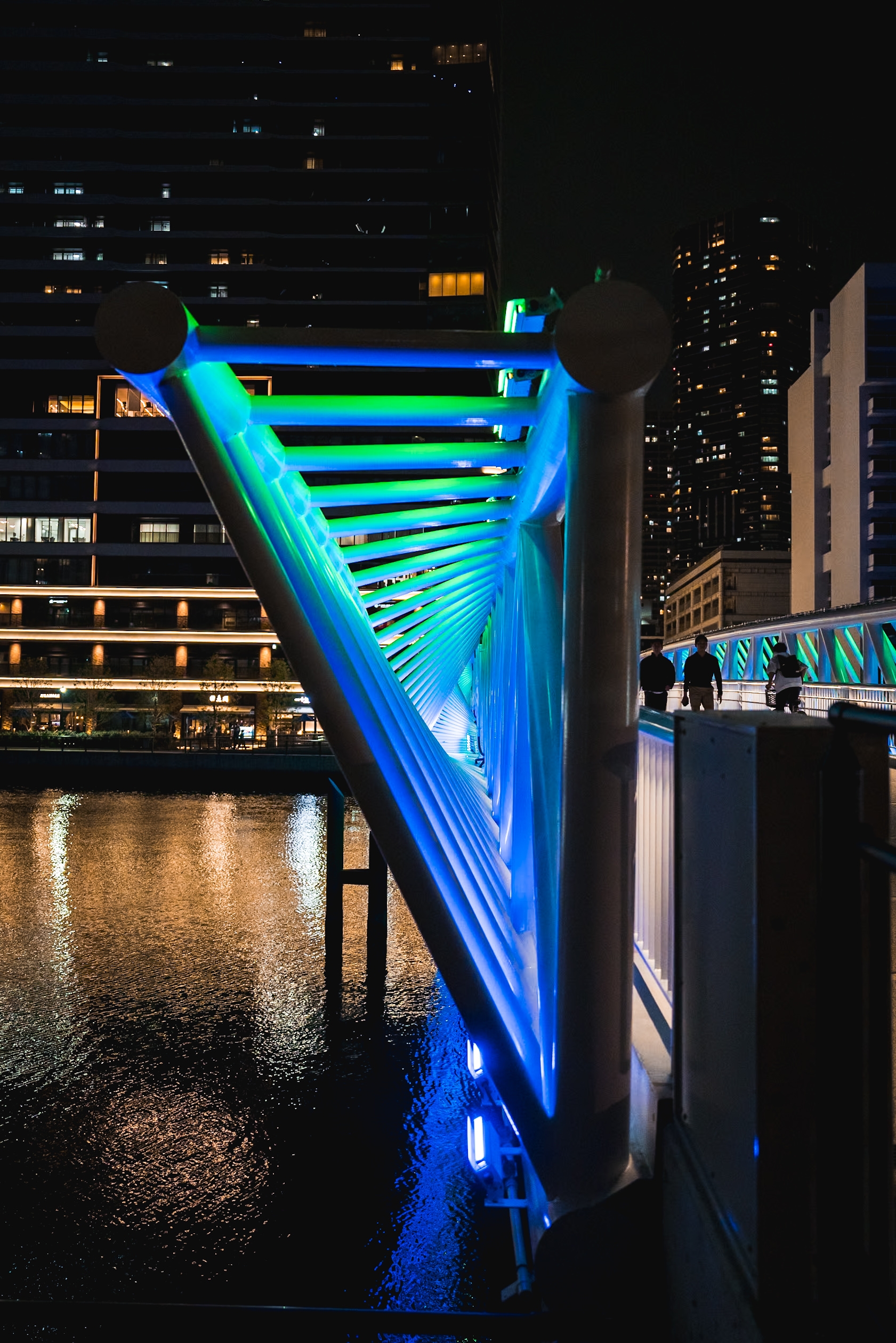
At night, the Reimei Kobashi footbridge stops behaving like infrastructure. In daylight, its steel frame belongs to the familiar grammar of urban redevelopment: clean engineering, disciplined repetition, efficient circulation across water. After dark, the bridge enters a different register. The lighting shifts the structure away from its utilitarian identity and places attention on rhythm, pacing, and surface perception. The canal becomes part of the composition. The truss no longer reads as static support. Every illuminated diagonal begins to participate in a visual current that travels across the span with the same quiet persistence as the water below.
What is striking in this project is the restraint of the gesture. Tokyo has no shortage of illuminated public works that confuse visibility with spectacle. This bridge avoids that trap with unusual discipline. The designers understood that the form already contained movement before a single luminaire was installed. The arching structure carries an internal cadence through its repeating triangular members, and the lighting strategy works by exposing that cadence rather than overwhelming it. The illumination does not flatten the bridge into an object of pure brightness. It preserves shadow within the geometry, allowing the steel members to maintain thickness, depth, and tension against the night sky. 
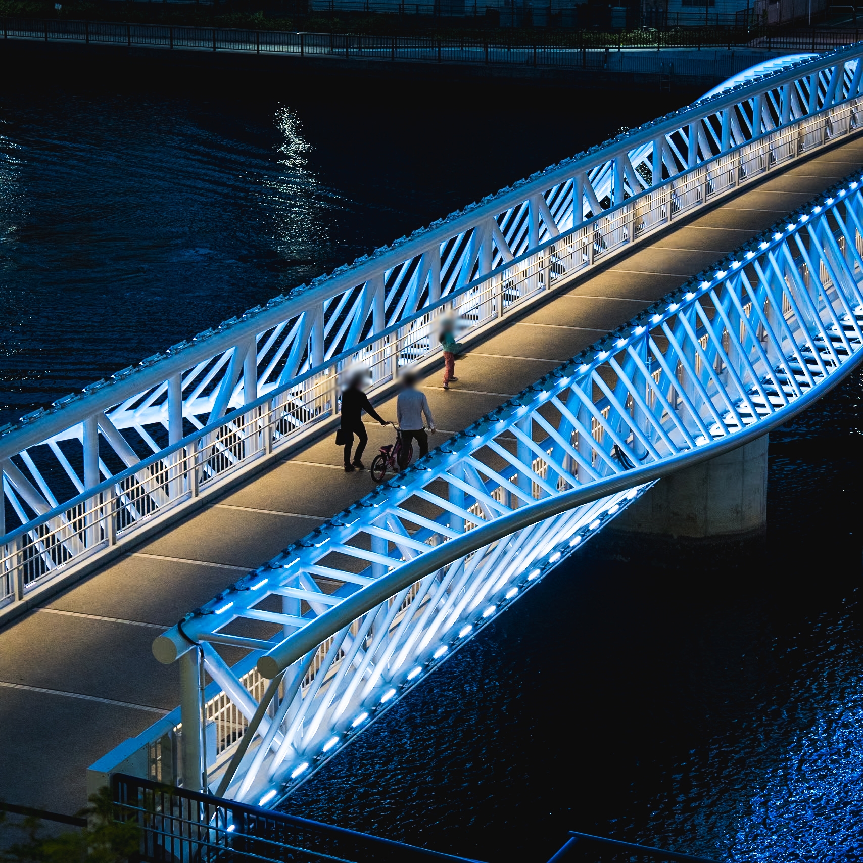
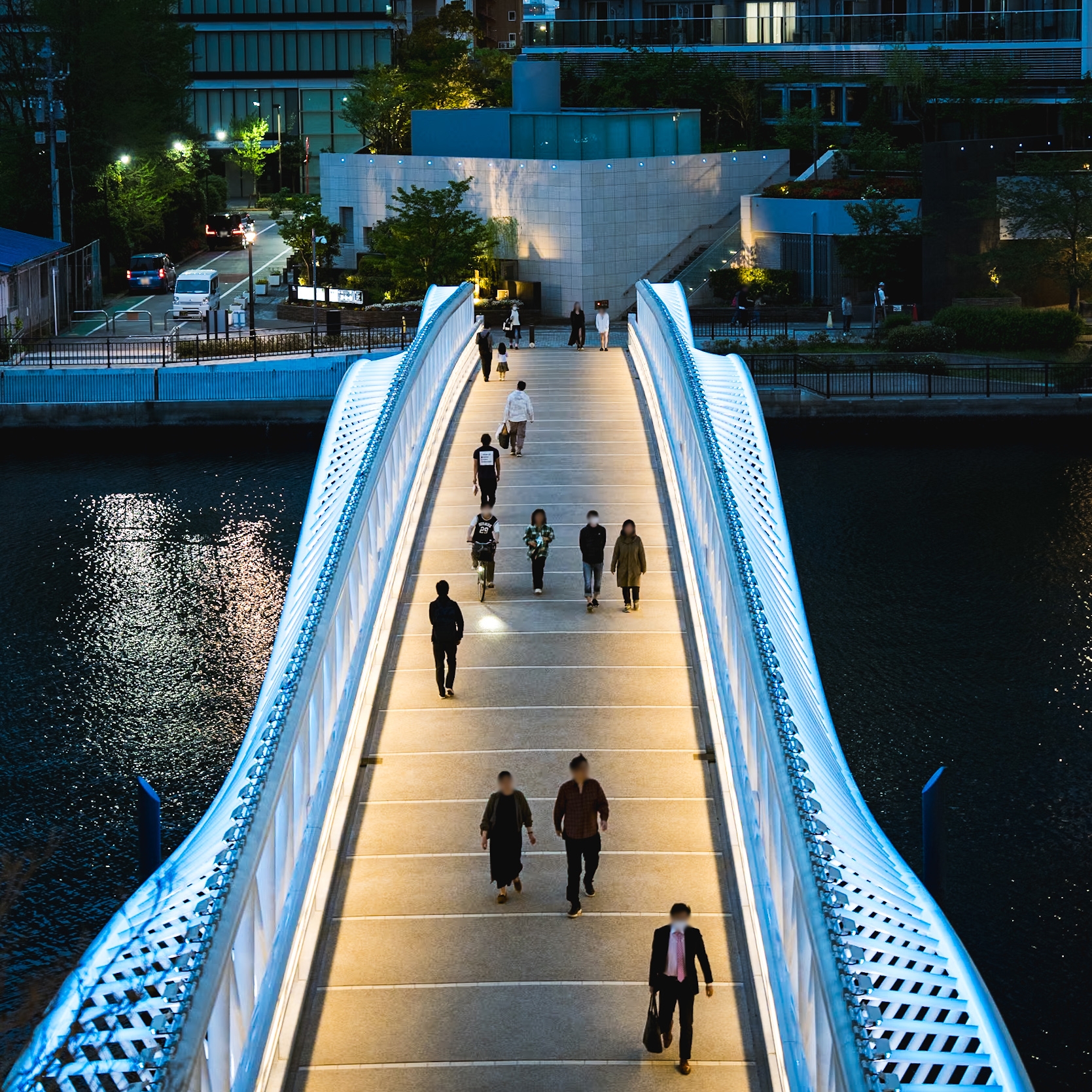
The decision to place illumination along the structural edges creates an effect that feels almost infrastructural in its logic, as if the bridge were generating light from internal pressure. The eye follows the illuminated ribs instinctively. Seen from a distance, the bridge resembles a line drawing suspended above black water. Seen from closer angles, the lighting reveals how carefully the hierarchy of luminance has been controlled. The walking surface remains comparatively warm and subdued, while the structural frame carries the cooler chromatic identity. That separation matters. Without it, pedestrians would dissolve into the spectacle of the structure itself. Here, the human figure remains legible. People crossing the bridge appear grounded inside the composition instead of swallowed by it.
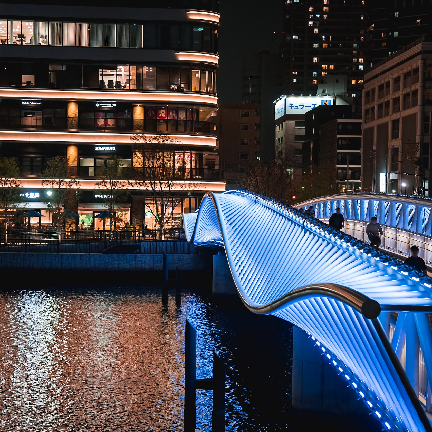
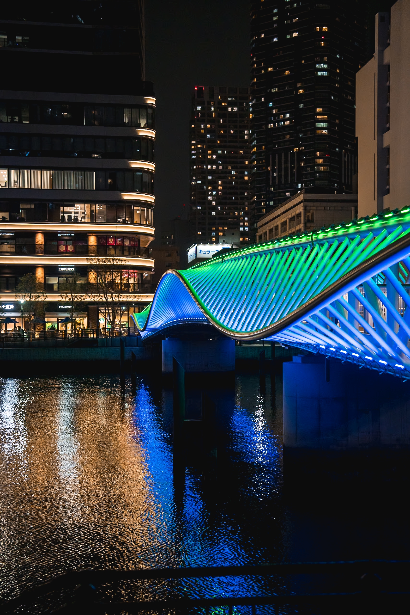
The blue-white palette introduces an atmosphere that sits somewhere between civic calm and theatrical staging. In photographs, the color temperature risks appearing slightly over-articulated, especially along the lower truss where the luminaires become individually perceptible. Yet in the context of the canal, the cool spectrum performs an important spatial function. The reflected light extends the bridge vertically into the water, doubling its presence without requiring additional architectural mass. The canal participates as a reflective field, carrying fragmented traces of the structure downstream. That relationship between object and reflection gives the bridge a temporal quality. The image never settles fully. Ripples distort the geometry continuously, producing a soft instability beneath the rigid frame.
The programmable color transitions are the most delicate aspect of the project conceptually. Dynamic lighting in public space often ages quickly because movement and color are treated as entertainment systems attached to architecture. Here, the programming appears intentionally slowed down, almost reluctant to announce itself. The transitions do not chase attention aggressively. They operate at the edge of perception, which is a far more difficult calibration. A pedestrian may not consciously register the moment a hue begins to shift, though the emotional temperature of the space changes gradually during the crossing. That subtlety reveals confidence on the part of the lighting designers. Fast-changing sequences would have reduced the bridge to urban decoration. The slower rhythm allows the structure to remain dignified.
At the same time, the project occasionally approaches the threshold where atmosphere begins competing with structural clarity. Certain moments in the lower portions of the bridge push the luminance high enough that the detailing of the steel risks losing definition. The brightest zones compress visual depth, especially in photographs where exposure exaggerates the glow. The bridge is strongest when the lighting behaves as a tracing mechanism for geometry. It becomes less convincing when the illumination accumulates into luminous mass. This tension is minor, though it reveals how narrow the margin is between precision and excess in projects built around linear LED systems.
What deserves attention is the way the lighting reframes the social role of the bridge within this redeveloping district. Before illumination, the structure would have functioned primarily as connective tissue between parcels of urban growth. The lighting introduces duration into that experience. Crossing the canal no longer feels purely transitional. People slow down. Some pause near the railings. The bridge acquires the psychological condition of a place rather than a route. That transformation has little to do with brightness itself. It comes from the designers’ understanding that repetition, reflection, and gradual chromatic change can alter a pedestrian’s sense of time inside the city.
The project also demonstrates an unusually careful reading of scale. Large urban lighting installations frequently collapse into singular nighttime images intended for drone photography or promotional renderings. Reimei Kobashi works from multiple distances simultaneously. From afar, the bridge forms a quiet luminous arc hovering above darkness. From mid-range viewpoints, the triangular members establish rhythm and density. From the pedestrian level, the lighting becomes tactile. The handrails, walking surface, and illuminated steel create layers of proximity that keep the crossing emotionally inhabited. This multi-scalar coherence is difficult to achieve in civic lighting because urban projects are often designed around one heroic viewpoint. Here, the experience survives movement.
There is also an interesting contradiction embedded in the project’s visual language. The bridge presents itself as light and fluid, though its structure is fundamentally repetitive and industrial. The lighting amplifies this contradiction rather than concealing it. Each illuminated segment repeats with near-mechanical consistency, yet the reflections on the water dissolve that order instantly into vibration and fragmentation. The result feels unmistakably urban. Not romantic. Not nostalgic. The bridge accepts the engineered reality of Tokyo while allowing moments of visual softness to emerge at its edges.
What lingers after looking at the project for some time is not the color-changing system or the brightness of the trusses. It is the precision of the restraint. The designers resisted the temptation to turn the bridge into an oversized media object. They allowed darkness to remain present around it. The canal stays black in large areas. The sky is not polluted with unnecessary spill. The illuminated structure occupies a controlled visual bandwidth within the city. That discipline gives the project longevity. Urban lighting that survives beyond its opening year usually understands when to stop speaking.
Reimei Kobashi succeeds because the lighting does not attempt to overwrite the bridge’s architecture. It studies the structure closely enough to recognize where movement already exists, where reflection already exists, where rhythm already exists. The intervention becomes an act of editing perception. In a redeveloping district filled with new surfaces competing for attention, this bridge avoids visual panic. It holds its position quietly over the canal, carrying light across steel with the same measured continuity as water moving under it. Human beings, naturally, needed LEDs to rediscover that a bridge crossing water at night could still feel memorable. Civilization continues its long campaign against subtlety, interrupted occasionally by projects like this.