


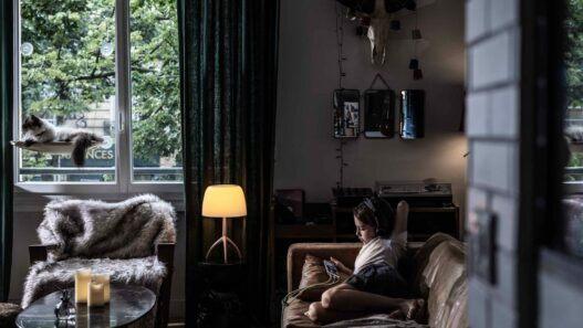


Few contemporary directors approach the use of light in their films with the same creative intensity and innovation as Tim Burton does, and his latest project “Wednesday” provides him with an expansive and vibrant playground to explore this element. The show’s lighting is much more than mere window dressing or decorative embellishment; it serves as an essential part of the narrative’s structure. It functions as a unique form of grammar that builds spatial psychology, skillfully shapes the overall tone, and subtly nudges the performances of the actors, all while cleverly refreshing the classic Burton Gothic aesthetic to fit seamlessly within the modern streaming age. From the very first minutes of the show, it becomes abundantly clear that the creative team is not pursuing a depiction of realism. Instead, they are in search of expressive credibility, where every practical lamp utilized, each shaft of light that breaks through the haze, and every glint reflected in Jenna Ortega’s captivating eyes contribute significantly to the strange yet compelling heartbeat of the plot.
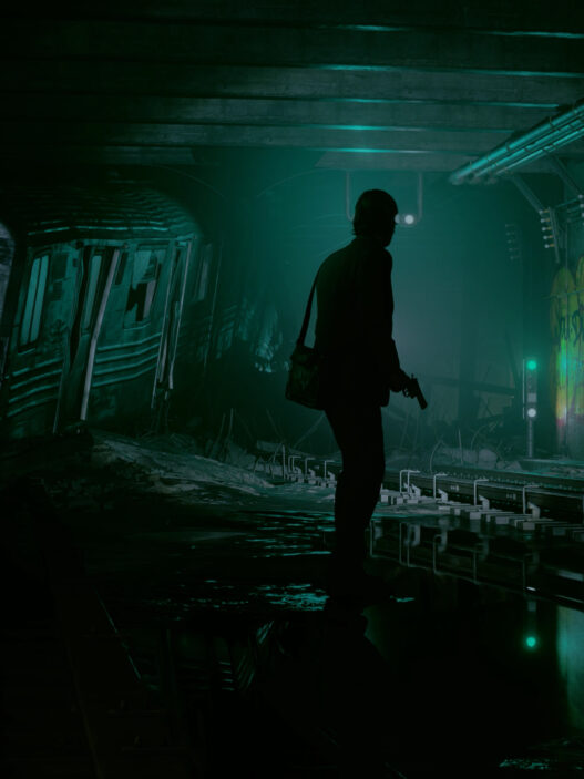
Consider, for a moment, the very idea of Nevermore Academy. This unique school presents itself as an imposing stone mass characterized by a complex arrangement of arches, winding stairwells, and towering chapel windows. The light interacts with this intricate architecture in a way that maps its contours and shapes more than it actually reveals its full essence. A thick haze envelops the space, functioning much like charcoal in an artist’s hand, effectively catching beams of light to carve out depth and dimension, transforming corridors into layered cutouts that create a fascinating visual experience. Daylight, however, is a rare visitor within these walls; it rarely floods the interior space with illumination. Instead, it slices through in sharp, defined angles. You cannot help but feel that the building exists as a series of thresholds which Wednesday has the ability to cross, yet she never truly feels as though she belongs within them. These dramatic planes of light are not merely aesthetically pleasing; they serve an important purpose as they maintain the clarity of the compositions when the costumes worn by individuals and the walls around them often share the same dark values. The eye instinctively seeks out the brightest plane of light first, then moves to find Wednesday herself, followed closely by the shadow that trails behind her, resembling a second costume that she cannot escape.
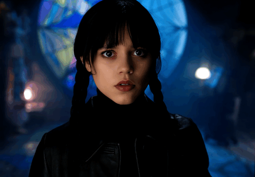
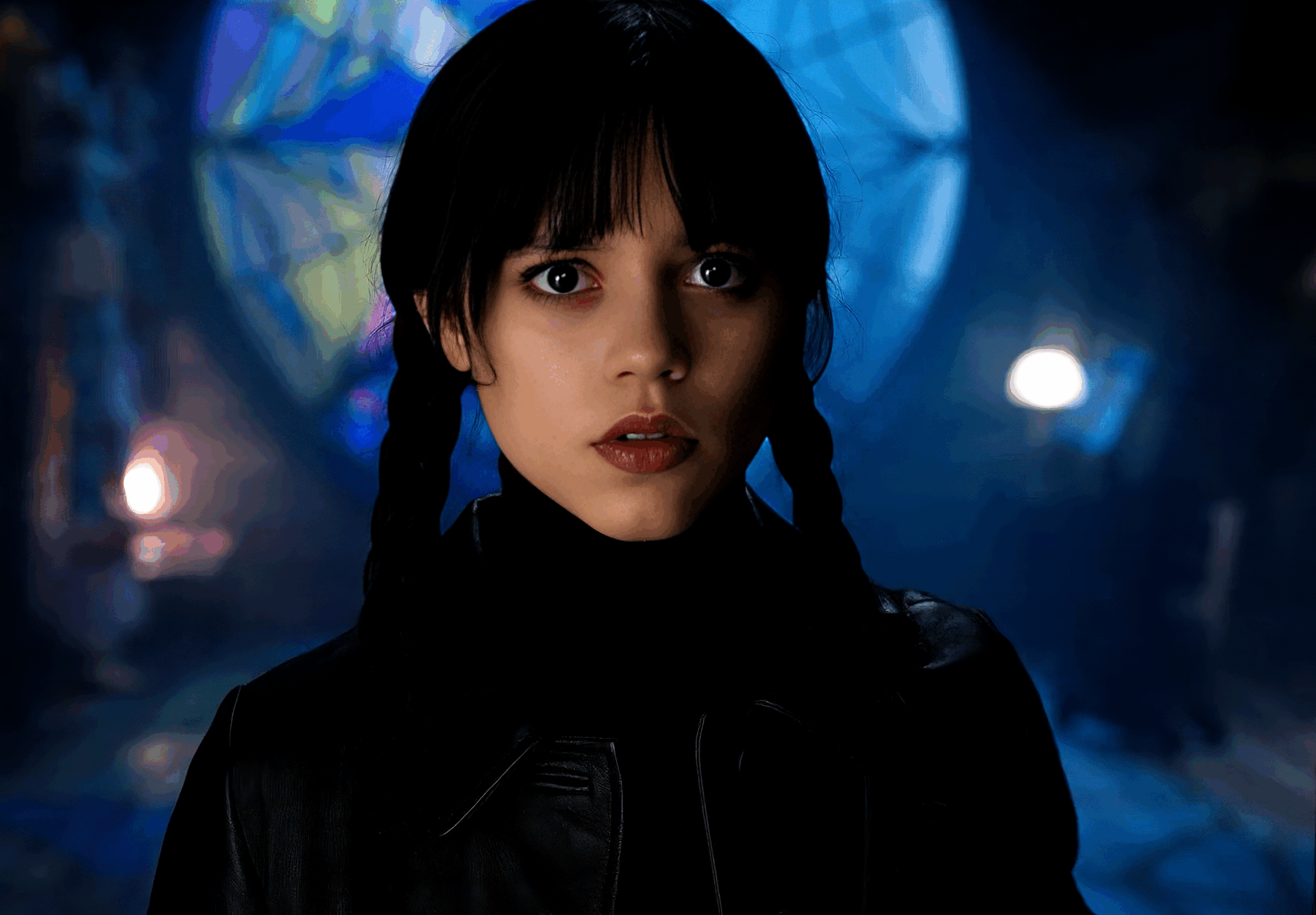
The show’s signature face lighting for Ortega is one of its most elegant and disciplined choices. The character lives on the line between doll-like stillness and razor wit, so the lighting cultivates a specific mask. Key light lives high and narrow, often slightly cross keyed. Fill is held low, but there is always an intentional catchlight near camera axis that paints a precise dot in her pupils. The result is a gaze that reads as unblinking without becoming dead. Her eyes feel like ink wells. The hairline gets a restrained rim, never an aggressive backlight that would glamorize her. This restraint is crucial. Burton lets the eyes be the lightest part of the frame when he wants a punchline, and the darkest when he wants menace. Either way, control is the joke. 
Color temperature becomes a map of social alignment. The town of Jericho leans warm and amber, with sodium street pools, tungsten cafe glow, and soft window spill that makes even the sheriff’s office feel grounded. Nevermore sweeps cool, somewhere between moon steel and sickly teal. The shift is not a cliché. It creates continuity across directors and episodes and becomes a narrative hinge. When Wednesday steps into the Weathervane cafe, the warmth does not soften her. It throws her coolness into relief. When the warmth invades Nevermore, as in candlelit rituals or family visits, the clash reads as thematic, not decorative. Burton has long understood that light is the simplest way to mark a world as safe or strange, and the series weaponizes that binary with sly humor.
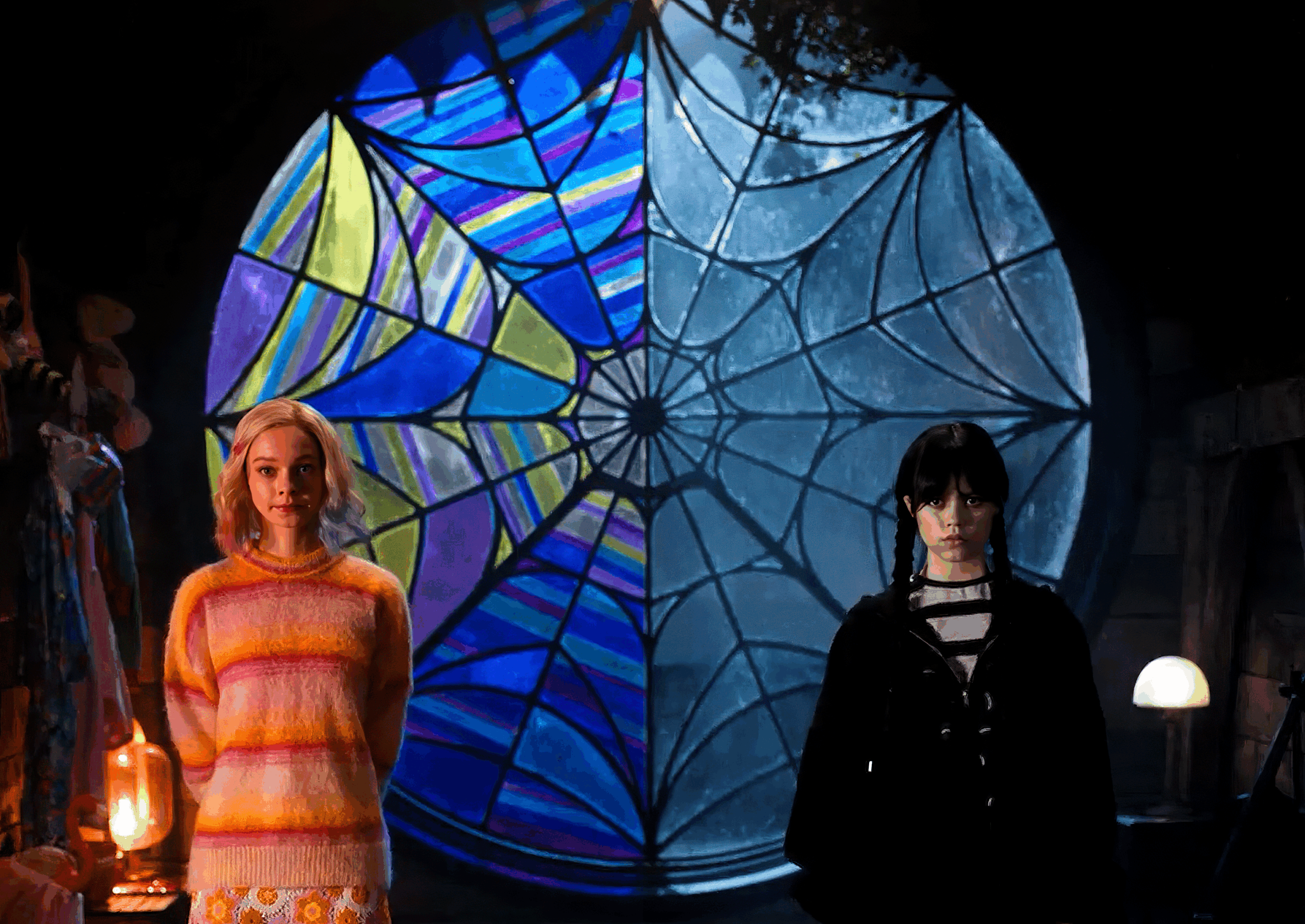
The dorm room can arguably be considered the show’s most overt and literal lighting gag that plays a pivotal role in the overall aesthetic. The stunning stained glass window that elegantly crowns Ophelia Hall effectively splits the space of the room, and it also divides the quality of light. On Enid’s side, the light catches and spills out in vibrant, chromatic hues that dance playfully across the plush textures of her area. In stark contrast, Wednesday’s side presents a more subdued and comparatively neutral palette, characterized by harder edges and minimal light bounce that creates a different atmosphere altogether. During the daytime, the intricate glass projection casts a lively mosaic pattern that refuses to remain still or calm. You are treated to quivering reflections that flicker across the floorboards, while above, a little color crawls across the ceiling, creating a dynamic interplay of light. At night, the practical lights transform into distinctive characters within the scene. Enid’s fairy lights and neon bracelets become charming little pops of confetti that add whimsical touches, while Wednesday’s lamps, on the other hand, are straightforward, directional, and often dimmed down to create a stark, austere pool of light. If one were to attempt to teach motivated lighting techniques to students, they could effectively freeze that room at various times throughout the day and then challenge them to reverse engineer the lighting plan. This exercise would undoubtedly serve as a remarkable master class in the art of lighting design.
The therapy sessions with Dr. Kinbott offer a counterpoint. These rooms use a flattering, soft daylight with warm accents, but Burton and his collaborators refuse to let them turn bland. There is almost always a slight asymmetry. One side of Wednesday’s face falls off into coolness, even if the global tone is inviting. Frames often hold a background practical that is too bright for comfort. You feel surveillance. It is gentle and wrong at the same time. The light says this is supposed to be safe, but it is still a diagnostic cage. Similar environments often get this wrong, smoothing everything until it looks like an advertisement. “Wednesday” holds back on fill in a way that protects character paradox.
The forest sequences go for the classic fairy tale look, although the series trims the romantic edges. Moonlight becomes a system rather than a single source. Hard back edges clip hair and tree bark, while softer toppy ambience in cool cyan keeps skin readable. Atmosphere thickens in pockets, not a uniform fog blanket, which lets the crew reveal or conceal the monster with reliable precision. When the Hyde strikes, brightest values often live in offscreen negative space, which makes the blows feel like they arrive from a world brighter than ours. This is clever blocking with light. You get silhouette, then half reveal, then a slash of highlight that arrives a beat late. The sequence rhythm owes as much to the dimmer board as to the edit.
One of the show’s triumphs is the Rave’N dance. It is a lighting joke and a character portrait. Blacklight turns the gym into a ghost aquarium. Whites bloom to luminescent blue, skin takes on a faint pallor, and anything treated with reactive paint pops. Wednesday in a dark dress skates through this without a glow. She becomes negative space that moves, an absence crossing presence. When the sprinklers dump red dye, the scene pivots from UV cool to wet crimson bounce. Blue plus red can be garish, but here the contrast sings because the blacks have been protected all night. Her pale face, anchored by that surgical catchlight in her eyes, remains the frame’s north star. The dance is memorable not only because of the choreography. The lighting makes it an argument about how she enters a crowd without becoming part of it.
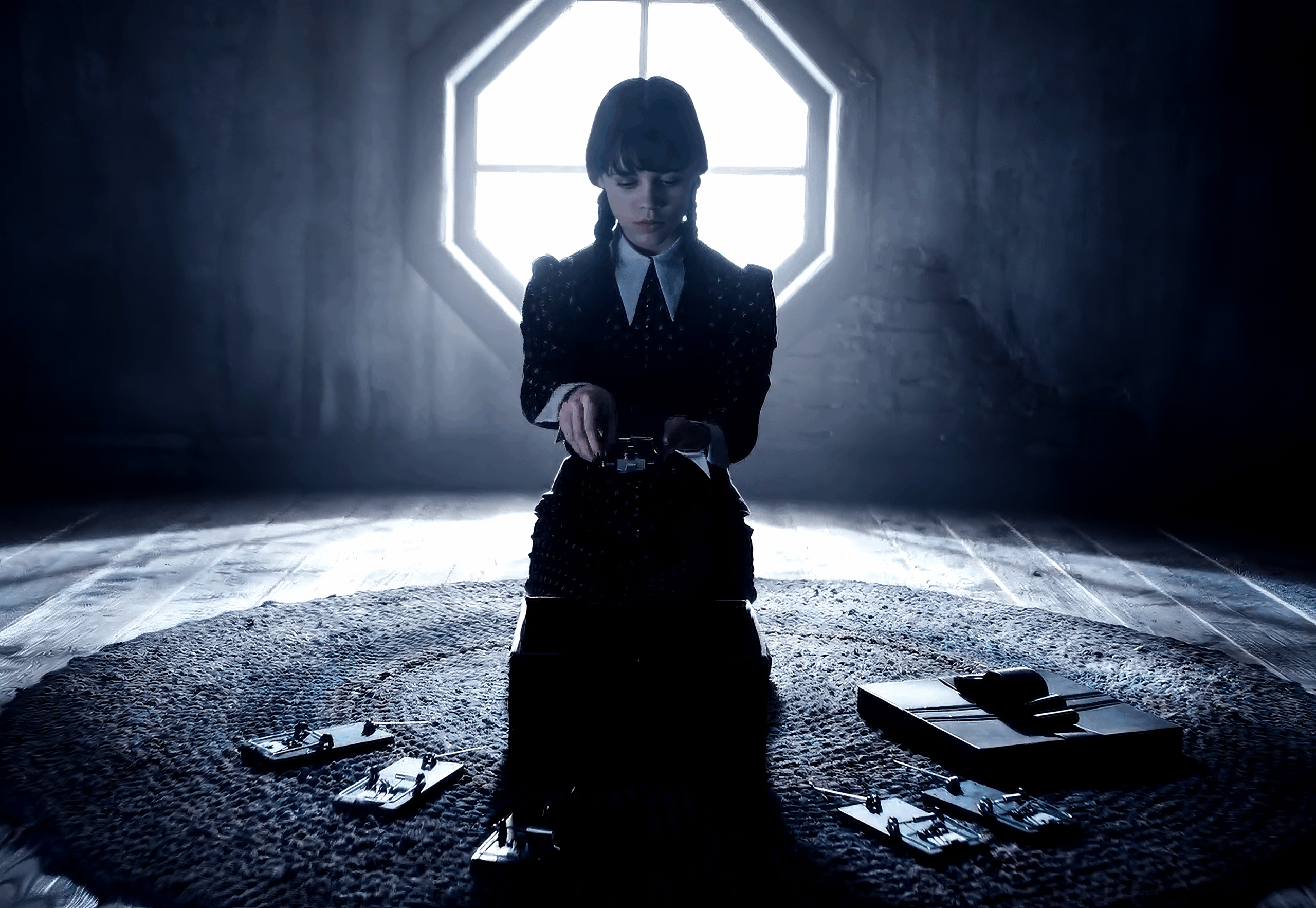
Inside the school’s crypts, tunnels, and secret rooms, the show leans into single-source logic that feels both motivated and stylized. Lanterns and candles are allowed to clip. Highlights flirt with blooming but rarely cross into milky HDR glare. Darkness is not a void. It has grain, texture, and contour, which is a lesson many streaming dramas still struggle to learn. The team often lets a little warm side light brush the stone, then introduces a tiny cold tick on the opposite cheek from an unseen shaft. The eye reads an entire underground network from two tones on a face. In narrative terms, this makes Wednesday’s investigations feel earned. She is assembling a world from fragments. The light obeys her method.
If the series sometimes overreaches, it is in the occasional urge to decorate. A few night exteriors render with so much haze and beam choreography that they edge toward self-parody. Burton has always loved a theatrical silhouette against sculpted light. In episodic form, the repetition can flatten impact. The show is at its strongest when the bravura is sneaky. The best images have a photographic calm, as if the crew trusted a single hard source through a high window and let stone and cloth do the rest. When that confidence wavers, you feel the dimmer riding and the toppers migrating shot to shot, and the spell flickers.
Color choices tell a secondary story about adolescence. The palette has the bruised blues and grays one expects, but note the disciplined use of saturated accents. A ribbon of undead green wraps a corridor. A bakery case glows honeyed. A stained glass flower leaks a hopeful magenta onto a pillow. These are not random gels. They are emotional bookmarks. Burton understands that coming of age stories thrive on the friction between the world as it is and the self as it imagines itself. Light becomes the friction. The show withholds warmth until it can weaponize it. It withholds color until it can puncture the gloom with a petty joy or a private betrayal.
The series’ grade deserves praise for how it protects skin. When you push cool palettes this hard, actors can drift into plastic. Here, highlights remain tight and specular, and mids are carefully steered to hold blood. Ortega’s complexion reads as a living thing even when her character chooses the most cadaverous lighting on offer. This is part taste and part technical discipline. Black levels are set with musical intent, not purely to impress with contrast. In bright scenes, the team resists the urge to flatten for coverage. There are brave moments where a close-up embraces a hard uplight shadow from a desk lamp, or where a reverse angle allows a glare off glass. Those are choices, not accidents, and they are the choices of filmmakers who believe that a face looks truest when the light has an opinion.
Humor, in “Wednesday,” rides the same rails as the scares. You can see the lineage from “Beetlejuice” and “Sleepy Hollow,” where gags pop because the light treats the joke with deadly seriousness. A hand scuttles across a table, and it is lit like an opera aria. A teenage stare-down in a hallway gets a ten-foot shaft of angelic backlight as if it were a campaign poster. The dissonance is the laugh. Burton’s mastery lies in trusting that if the lighting says this is the most important moment of the day, the audience will feel the weight even while they smile. He is never embarrassed by his own devices, which lets the show wear stylization as confidence rather than costume. What elevates this particular achievement to a higher level of impressiveness is the fact that the show successfully maintains a distinctively Burtonesque sensibility throughout episodes that were not directed by him. This impressive feat is achieved not only through careful production design and consistent costume continuity, but also through a meticulously crafted lighting bible that dictates the visual style. You can truly sense the established rules at play: keep faces sculpted and well-defined, ensure that dark elements are protected, boldly motivate the light sources used, embrace the beam without hesitation, consistently provide Wednesday with her essential catchlight, and vigilantly maintain the color temperature map for both Nevermore and Jericho. Such a comprehensive rule set should not be viewed as a form of imprisonment for creativity. Instead, it functions more like a jazz chart, allowing different directors to improvise while still maintaining a cohesive groove.
The overall coherence of the season serves as compelling evidence that a robust visual language can indeed be taught and effectively shared, all without sacrificing individual personality or artistic expression. Perhaps the most telling illustration of Burton’s command is how often the lighting acts as a spoiler without giving plot away. When Wednesday is on the cusp of empathy, the light warms a half stop before she does. When betrayal is near, backgrounds pick up a metallic tint that makes the atmosphere feel colder, even if the key stays constant. Viewers might not articulate these shifts, but they feel them. The show trusts light to foreshadow. Cinema has always done this. Television too rarely does, especially in genre pieces that get lost in coverage. “Wednesday” feels authored because the photons know the script. If we engage in minor disagreements or discussions, it is solely to express our desire for a few additional moments where honesty shines as brightly as daylight. The series at times seems to treat the sun as though it were something to be embarrassed about, as if it must be filtered, angled, and manipulated into submission, rather than embraced. The rare occasions when open shade allows skin to breathe freely and wardrobes to display texture authentically without any artistic tricks are truly refreshing and invigorating. Achieving a balance between a theatrical nocturne and a straightforward noon could significantly enrich the storytelling in future seasons, particularly as the characters continue to mature and develop. Growing up involves, in part, the realization that monsters appear quite different when viewed in the clarity of simple light.
The show demonstrates enough intelligence and awareness to make that important adjustment if it chooses to do so. Ultimately, what firmly establishes “Wednesday” as a significant lighting milestone in the realm of television is the unwavering clarity of its creative purpose. Director Tim Burton and his dedicated team do not simply pursue fleeting trends. They intentionally avoid the superficial, flat gloss that frequently overwhelms high-quality streaming content. Instead, they meticulously construct an entire world where light functions as a complex code that anyone can decipher, regardless of their familiarity with the specific terms or nuances involved. This intricate code communicates that this girl will not be dulled or softened by your illuminating glow, but rather, she will confidently claim your shadow as her own. It suggests that this educational institution operates as a labyrinth filled with thresholds, and each threshold contains a brilliantly lit idea waiting to be explored. Moreover, it implies that comedy and horror intertwine, sharing a single light bulb, while the dimmer switch is skillfully controlled by expert hands who know precisely how to manipulate it. The series radiates with the boldness of artisans who fully comprehend that the most direct route to a viewer’s imagination is achieved through a focused beam shining through a door, a captivating dot in an eye, and a surrounding darkness that powerfully conveys a message of “not now, not yet, so keep watching for more.”