


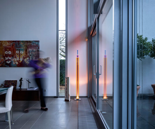
A luminous homage to architecture
When I first encountered Uptown, my initial impression of the designer’s intention took shape: light as material, glass volume as the shell, and color as language. There is an unmistakable architectural resonance in its form, one that subtly recalls the vertical silhouettes of New York’s skyscrapers, most notably the Empire State Building, with its ascending tiers and geometric precision. This resemblance is not literal but emotional: a translation of urban grandeur into a luminous totem, where the nostalgia of metropolitan architecture merges with the intimacy of interior space.
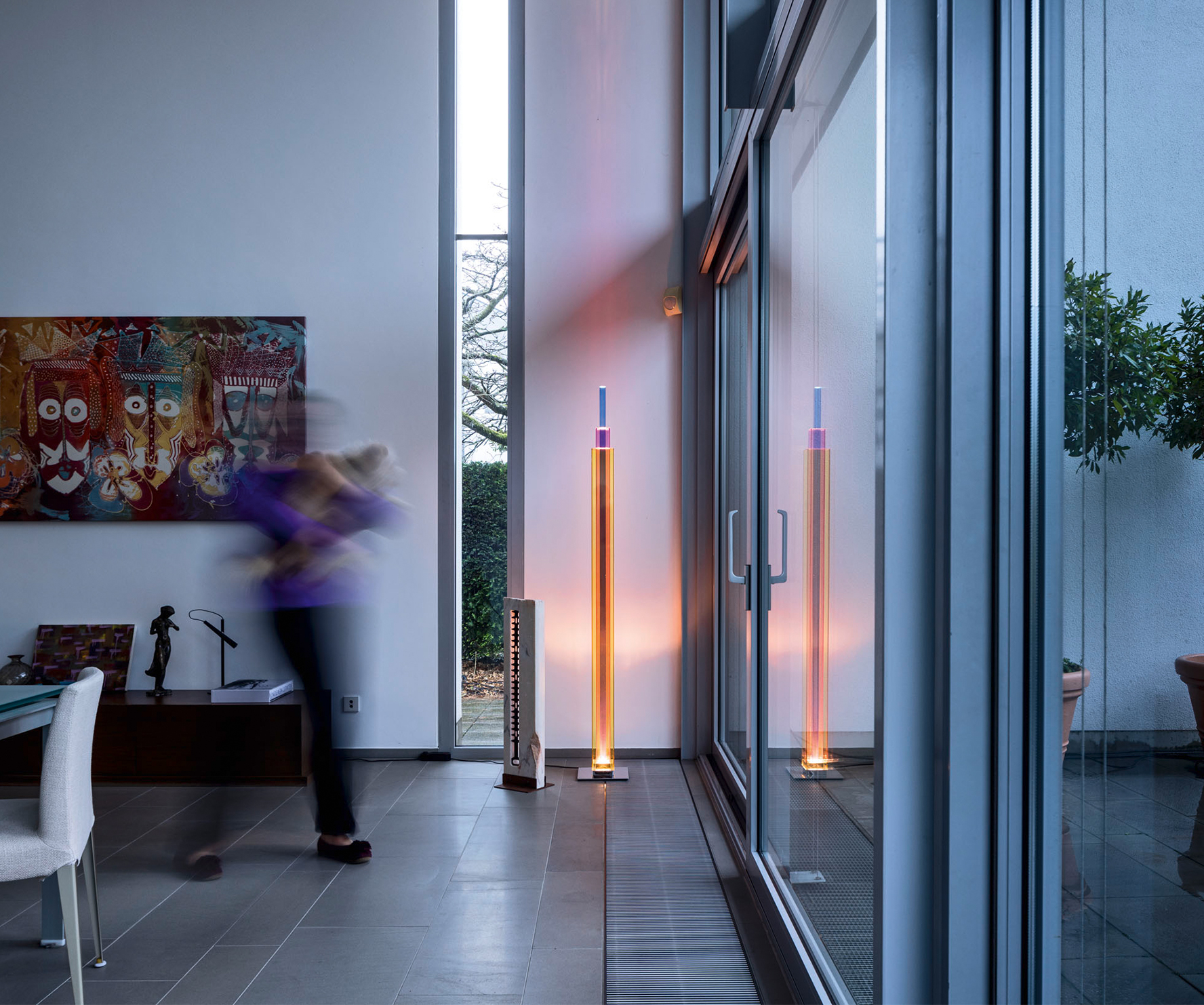
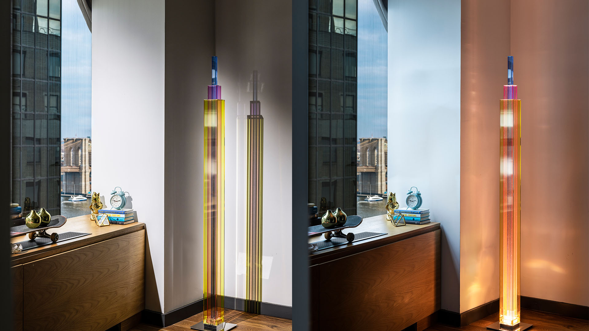
The form is simple yet assertive, a tall column composed of transparent planes stacked vertically, bringing the concept of a skyscraper into the interior on a reduced scale. This verticality clarifies the designer’s aim: to create a vertical marker that functions simultaneously as an ornamental object and a source of light. The choice of three primary-colored panels yellow, red, and blue, is an operation on the language of color that, through overlapping, produces secondary hues and, by means of transparency, creates visual layering. These layers are not mere decoration; they are spectral filters that shape the passage of light, producing tones that arise purely from the physical interaction between light and glass.
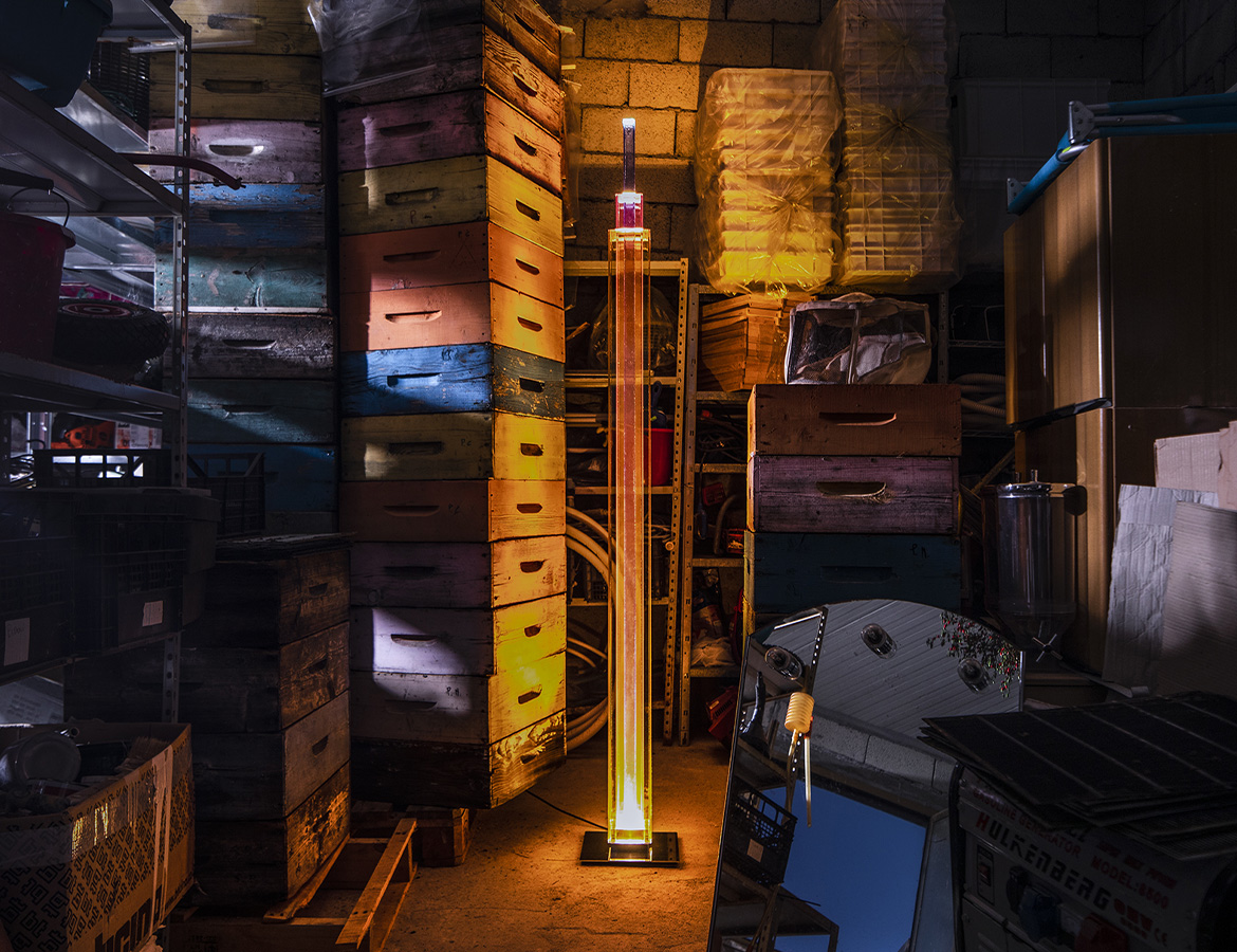
The luminous behavior emerging from this structure is where the lighting design achieves its strongest impact. There is a combination of direct transmission and multi-layer reflection that generates streaks and patterns of color on nearby reflective surfaces. These patterns increase the spatial depth and activate the architectural frame, especially alongside glossy or glass surfaces where reflection amplifies color dispersion. From a distance, it acts as a spatial beacon; up close, the tactile quality of the material and the accessibility of the light source become equally significant. 
From a photometric standpoint, the key aspects worth highlighting are light uniformity, glare control, and spectral quality. The transparent structure and flat surfaces might expose the inner source from certain angles and create glare, unless properly shielded or diffused. The reduction of color rendering accuracy under colored light is inevitable, and this must be accepted as a design choice rather than a technical flaw, since the designer’s intention is to create a chromatic experience and visual emotion, not accurate color reproduction. The value of this decision becomes evident in exhibition spaces, lobbies, or rooms that aim to emphasize visual identity. In spaces requiring precise color perception or task illumination, however, the piece loses practical efficiency.
From a practical perspective, mechanical stability, maintenance, and installation deserve careful attention. The relatively small base compared to its height requires attention to safety and balance to prevent tipping. If colored glass is used, weight and fragility increase; if acrylic is chosen, the structure becomes lighter but more prone to scratches, with differences in optical clarity. Accessibility for lamp replacement or repair, and the ability to dim the light for intensity control, would provide functional advantages, while their absence reduces adaptability.
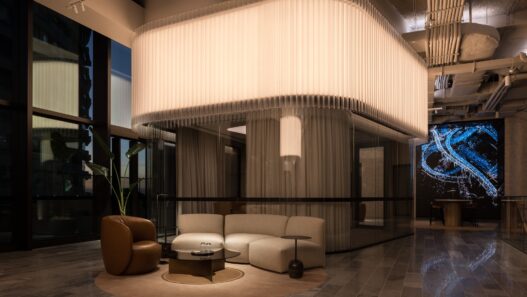
The spatial identity before illumination is often neutral and reliant on ambient light. Once Uptown is switched on, the nature of the space transforms; a focal point emerges, the color temperature shifts toward warmth, and vertical proportions are emphasized. The chromatic layering and reflections activate corners and glass surfaces, guiding the viewer’s gaze from floor to ceiling. This transformation is functional in the sense that light operates beyond visibility, it constructs identity.
In conclusion, this design is a statement in lighting that presents light as a designed material, and in that regard, it succeeds remarkably. The designer had a clear vision of translating the properties of material into a luminous language. My suggestion to a professional observer is to judge this piece within the context of its intent: an object meant to create presence, color, and position in space, not to deliver task lighting or spectral precision. There are technical aspects open to refinement that do not diminish the overall experience but become relevant in specific scenarios: glare management, mechanical stabilization, and adjustable intensity could extend its usability.