


Light Design Dialogues with Surface
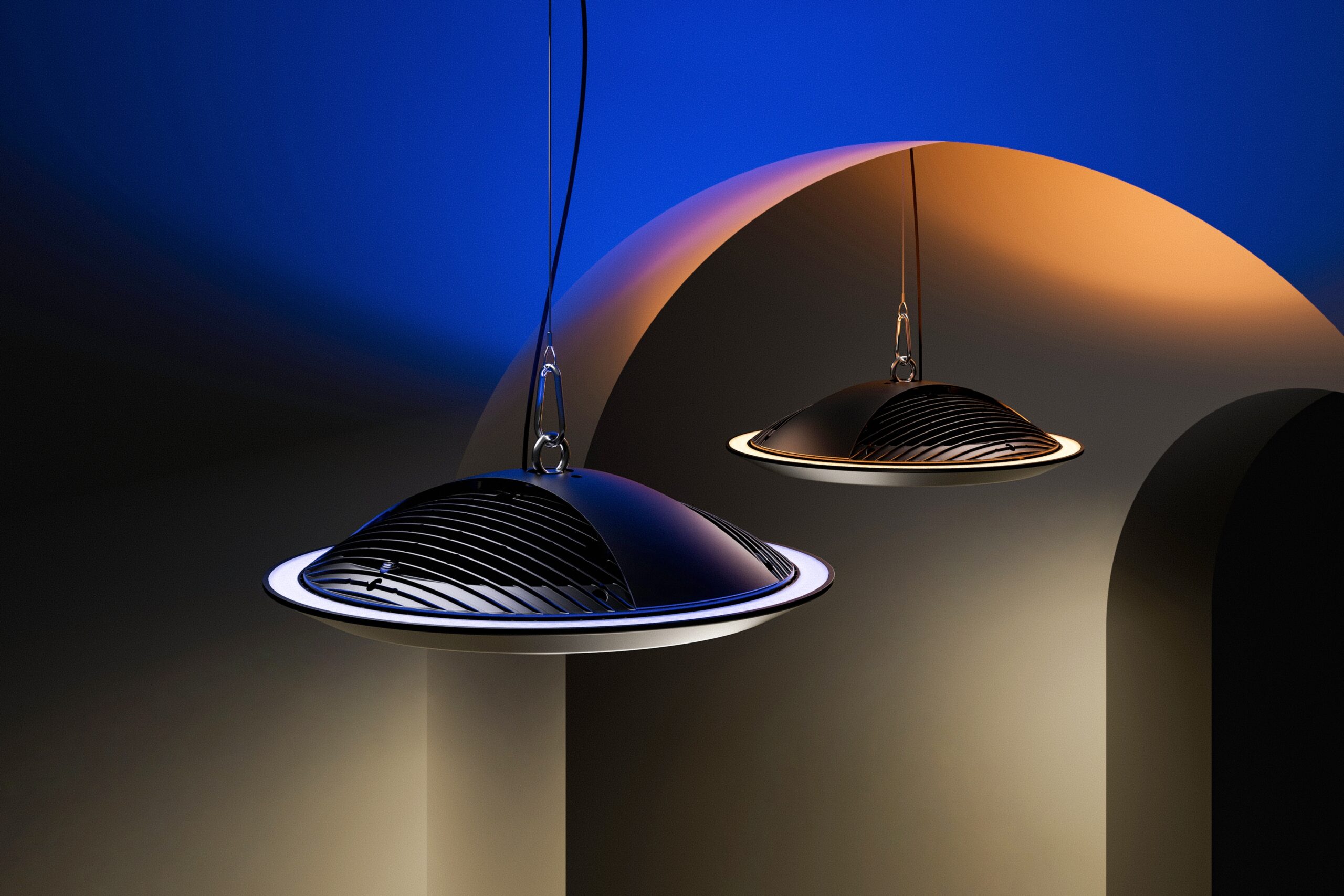
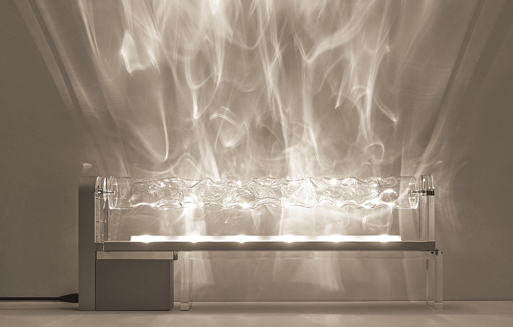
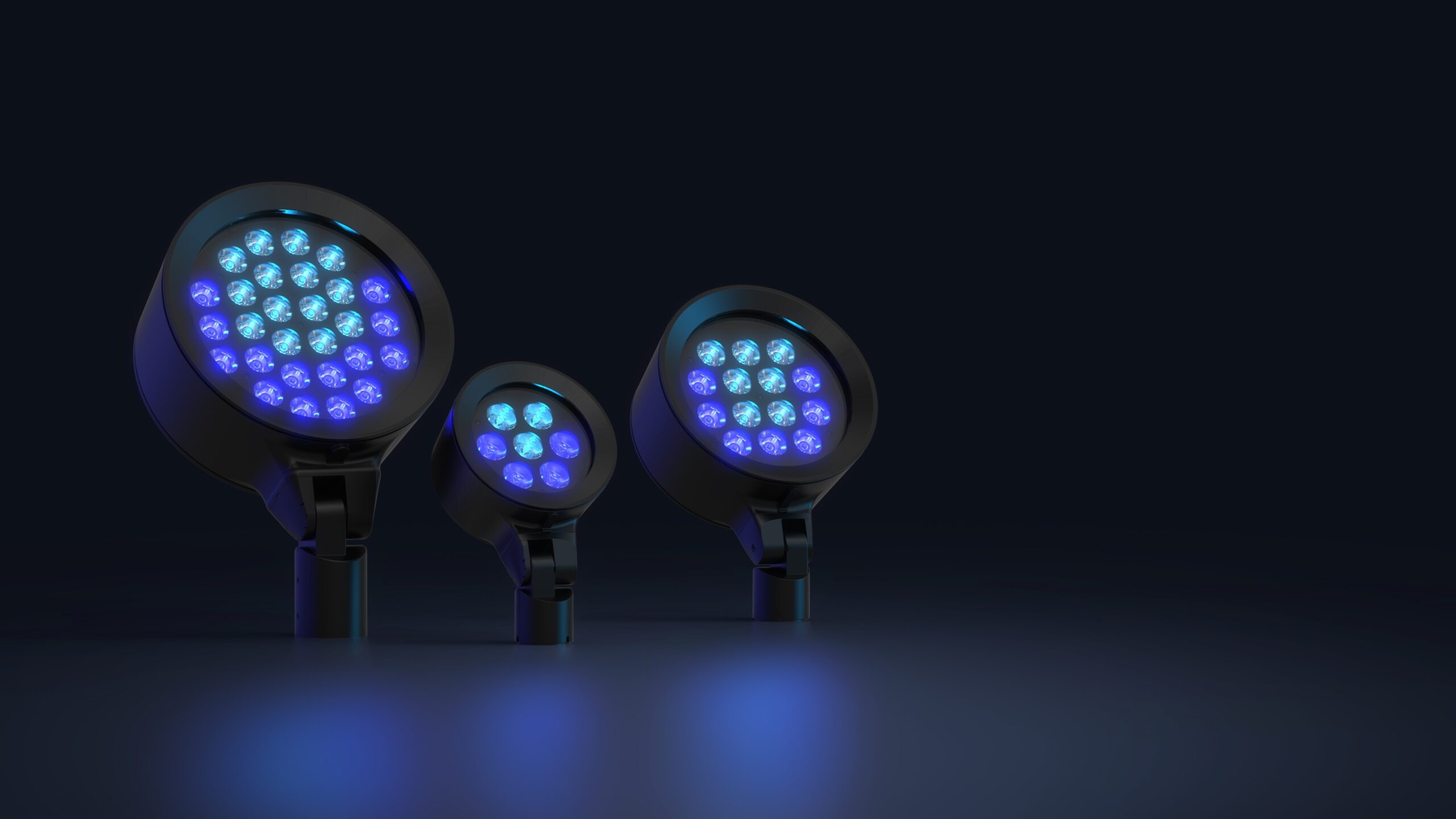
If we approach FLAME as a lighting technique rather than merely a fixture, the first thing that stands out is not the form of the luminaires, but the strategy of light distribution. The dual-beam concept, combining a central (10° or 30°) beam with a peripheral (30° to 70°) one, ensures that the light is not flat or one-dimensional. Instead of simply “illuminating a surface,” the design constructs spatial depth. This layered approach allows light to shape the object rather than just wash over it. This is evident in the curved structure and the way the color transitions from amber to violet. Light becomes a tool for revealing form, not just creating spectacle.
In terms of performance, FLAME is precise. Precision here means that every beam has a defined purpose. The NARROW version is suited for tight vertical planes and distant surfaces where focus is required without harsh drop-offs. On the other hand, WIDE works best in open areas, or where you want broad coverage while still maintaining control. The LOTUS variant, with its sharp central beam and broad outer spill, is ideal for creating vertical rhythm on façades or simulating light columns on flat walls. However, this is also where the first serious critique emerges. FLAME is not easy to control. Without an exact understanding of distance, intensity, and chromatic behavior, the result can slip into something more theatrical than architectural. In other words, FLAME is not a plug-and-play solution. It demands sensitivity to spatial composition and contextual light behavior.

On an aesthetic level, the real strength of FLAME lies in how it manages shadow, not just brightness. The concrete texture is not flattened but amplified. In weaker lighting designs, light often neutralizes or sterilizes materiality. Here, light and texture work together. The potential downside, however, emerges when the surface being lit lacks tactile identity. In such cases, the multi-layered beams might feel overly artificial. Therefore, applying this system requires a clear understanding of surface properties and how they interact with light. Using FLAME is not enough; it must be curated.
From a technical standpoint, the compact body and precision lenses reveal an awareness of architectural constraints. These fixtures integrate with the environment rather than overpowering it. They are particularly suited for minimal design languages. That said, in some views, the physical design of the luminaire feels slightly more industrial than the softness of its output suggests. There is a subtle disconnect between the poetic quality of the beam and the hardware that generates it.
Finally, if one were to search for an artistic analogy, not for superficial comparison but for structural similarity, FLAME bears resemblance to the lighting technique of Caravaggio. His use of sharply angled light revealed facial contours and physical form with clarity and tension. His light had direction but never felt flat or artificial. FLAME achieves something similar, though with a more architectural and less dramatic tone. The light is directional yet volumetric, controlled yet expressive.
Brand : Hydrel
Prize : LIT Lighting Design Award