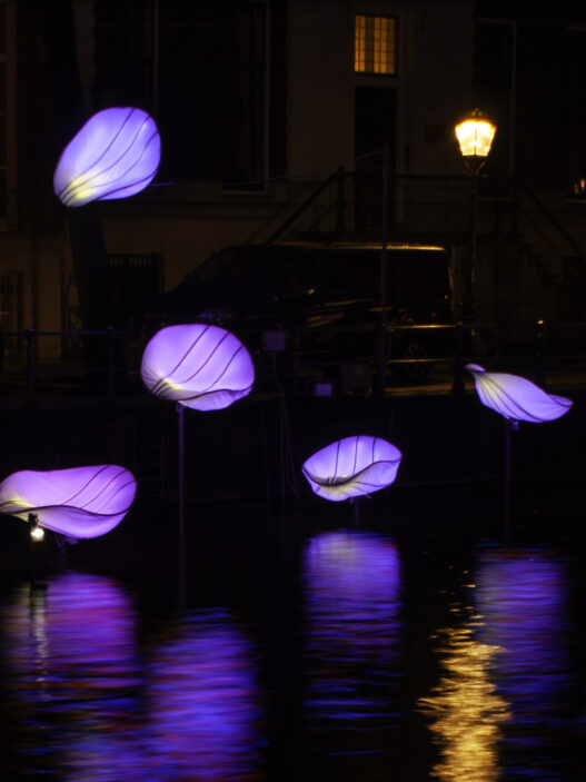


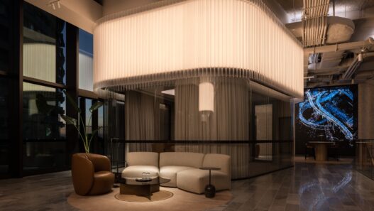


Interactive poetic underwater illumination
When I look at this project, I begin with a question: what boundary has the designer defined between visual beauty and interactive functionality? The answer lies clearly within the work; lighting here gives identity to the elements, makes structure legible, and builds the relationship between user and object around time and touch. Light acts simultaneously as messenger, responder, and space-maker, and this overlap of roles is the result of a purposeful design approach.
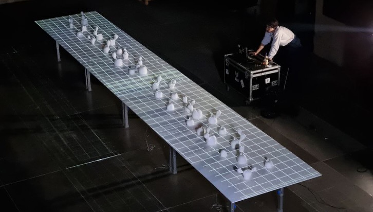
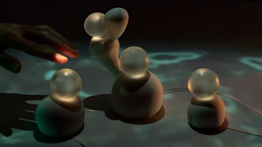
On the ten-meter table that has been carefully conceived, the distribution of light sources and interactive nodes has been thoughtfully chosen. The small glass spheres that play the role of corals contain internal light sources that balance localized brightness with the surrounding darkness. This internal illumination, with its warm color temperature seeping into the glass, strengthens the sense of materiality and presence. Meanwhile, the surface is covered with a bluish projection evoking the movement of water; this projection sets the narrative and situates the corals within a fluid environment, deepening the marine metaphor.
The sound interaction and built-in sensors perform effectively as triggers of light. When the user touches or introduces sound, a luminous response emanates from the coral’s surface and occasionally extends into broader visual patterns across the table. This responsiveness operates on multiple layers: first, the reflection of light on the glass and ceramic body; second, the shadow contours that define depth; and third, the projected visuals that reinforce the sense of a watery expanse. Such layering is essential for creating continuity between micro and macro scales, and the designer has succeeded in binding these levels within a coherent visual language. 
The quality of light directs the viewer’s gaze. The internal sources within the spheres act as visual notes, guiding the eye along the table and offering new information at every stop through variations in color and intensity. The warm inner glow and the cool blue background establish a chromatic harmony that resonates with both meaning and perception. This color pairing differentiates reflection and transmission behaviors; the glass sphere serves as a soft filter, rendering the inner detail semi-transparent and subtly awakening curiosity.
The distribution of light intensity and the control of its dynamics stand out as technical strengths. In moments of heightened reaction, local contrast increases and shadows around the forms grow more pronounced. This enhances volumetric presence and makes the tactile experience feel more authentic. Meanwhile, maintaining a dark, minimal environment keeps focus on interaction and prevents visual dispersion. From a user-experience standpoint, this is a sound decision; the viewer’s attention remains concentrated and the narrative of light stays under control.
Materially, the dialogue between the matte, ceramic-like bases and the transparent spheres is critical. This textural contrast allows light to behave differently across surfaces, the matte diffuses, the glossy reflects sharply. In combination with the projection, this interplay adds depth and enables the definition of multiple visual scenes. From a seasoned designer’s perspective, the choice and positioning of materials and light sources have been handled with skill and sensitivity.
Yet there are technical and experiential aspects that could benefit from refinement. First, the sensor response to time and input intensity would gain from more parametric calibration, avoiding repetitive rhythms and offering richer diversity of reactions. Designing time-layered response profiles could protect the experience from predictability and give each touch or sound input a distinctive hue of behavior. Second, glare control for close-range or angled viewers deserves more attention. Shaping the light beam around the spheres should eliminate unwanted reflections or hotspots that complicate the reading of form. Third, maintenance logistics should be carefully considered before final installation; servicing internal light sources and electronics in a moist, interactive setup requires structural foresight.
From the audience’s standpoint, the installation succeeds in creating a sense of mystery and agency that invites participation. The silence of the environment and the concentration of light create a moment of contemplation, which then transforms into movement through touch or sound. This transition is well formulated and narratively coherent. Still, the project’s full potential unfolds when the designer systematically broadens the spectrum of interactive behaviors, ensuring that different users can extract unique meanings through varied modes of engagement.