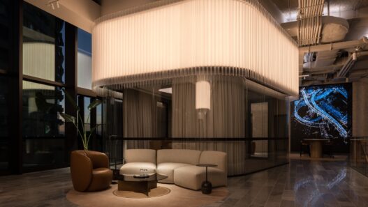
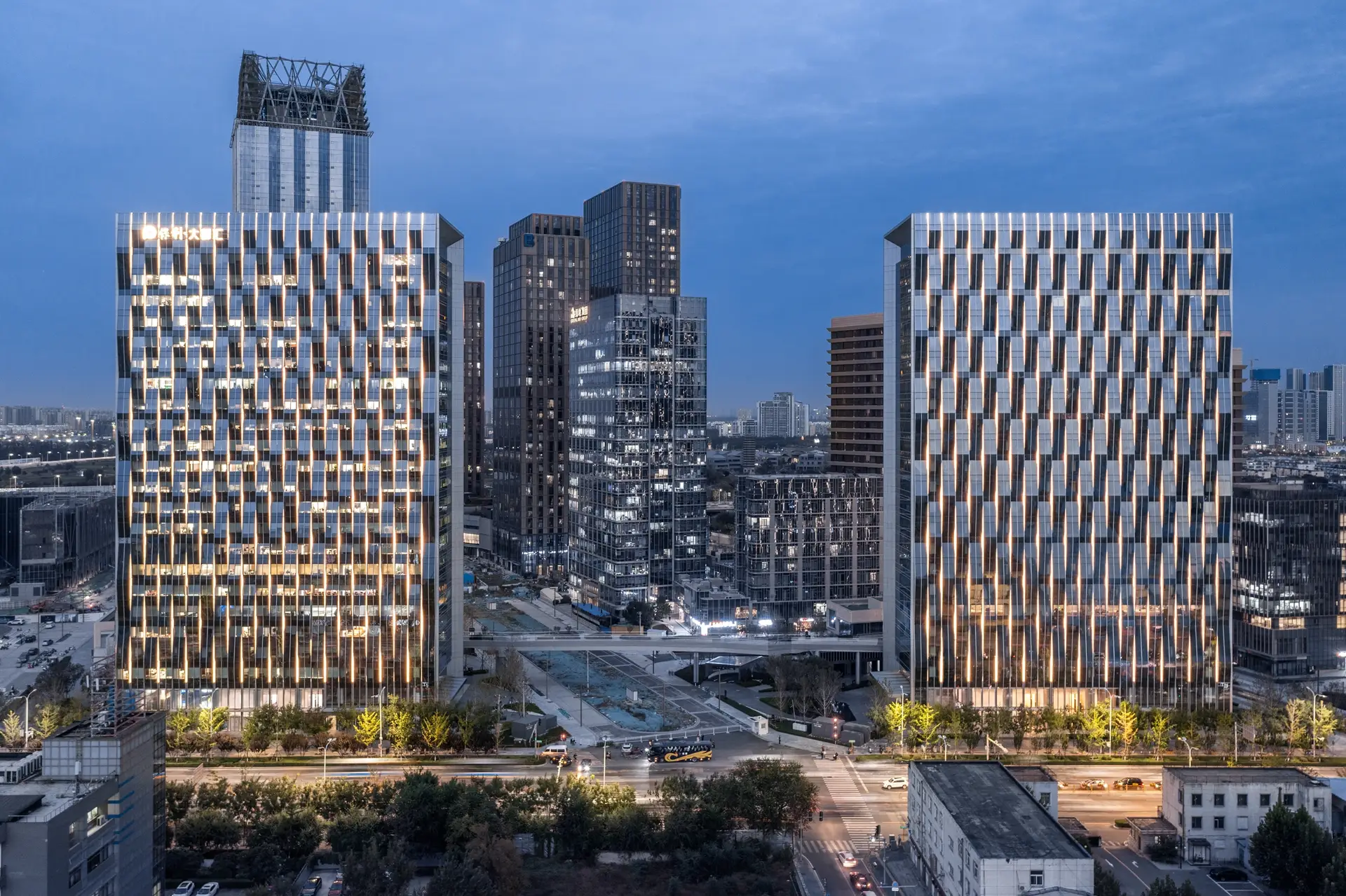
In criticizing the lighting design of the Beijing Polymetropolitan Building, it should be noted that although the design is visually appealing and well-inspired by the element of wave and movement, it may overemphasize the aesthetic aspects and its actual functionality in everyday use presents challenges. The building’s undulating facade and the use of intelligent and energy-efficient lighting create a sense of dynamism, but at the same time, this visual complexity may cause eye fatigue in the long run and lose its initial impact.

In terms of functionality, although the use of energy-saving technology is admirable and demonstrates concern for the environment and sustainability, the question is whether the lighting used has been able to strike a balance between beauty and functionality. Complex and repetitive lighting can lead to technical problems such as more difficult maintenance or high maintenance costs, which must be considered in a project of this scale.

In terms of gestalt, the repetition of wave patterns and layering conveys a sense of order and complexity at the same time, but in some cases, the audience may be looking for more simplicity and calm. The designer’s inspiration, although well expressed in the combination of water and urban architecture, could perhaps have shown more flexibility in adapting to other environments and be attractive not only to local viewers but also to non-local visitors.

Brand : Brandston Partnership inc.
Designers : Thomas Lee, Lancy Chen, Zhen Chen, Summer Kang, He Zhu, Na li
Photo Credits : Poly Development, Webb Deco, GP Architect
Prize: LIT Lighting Design Award
