


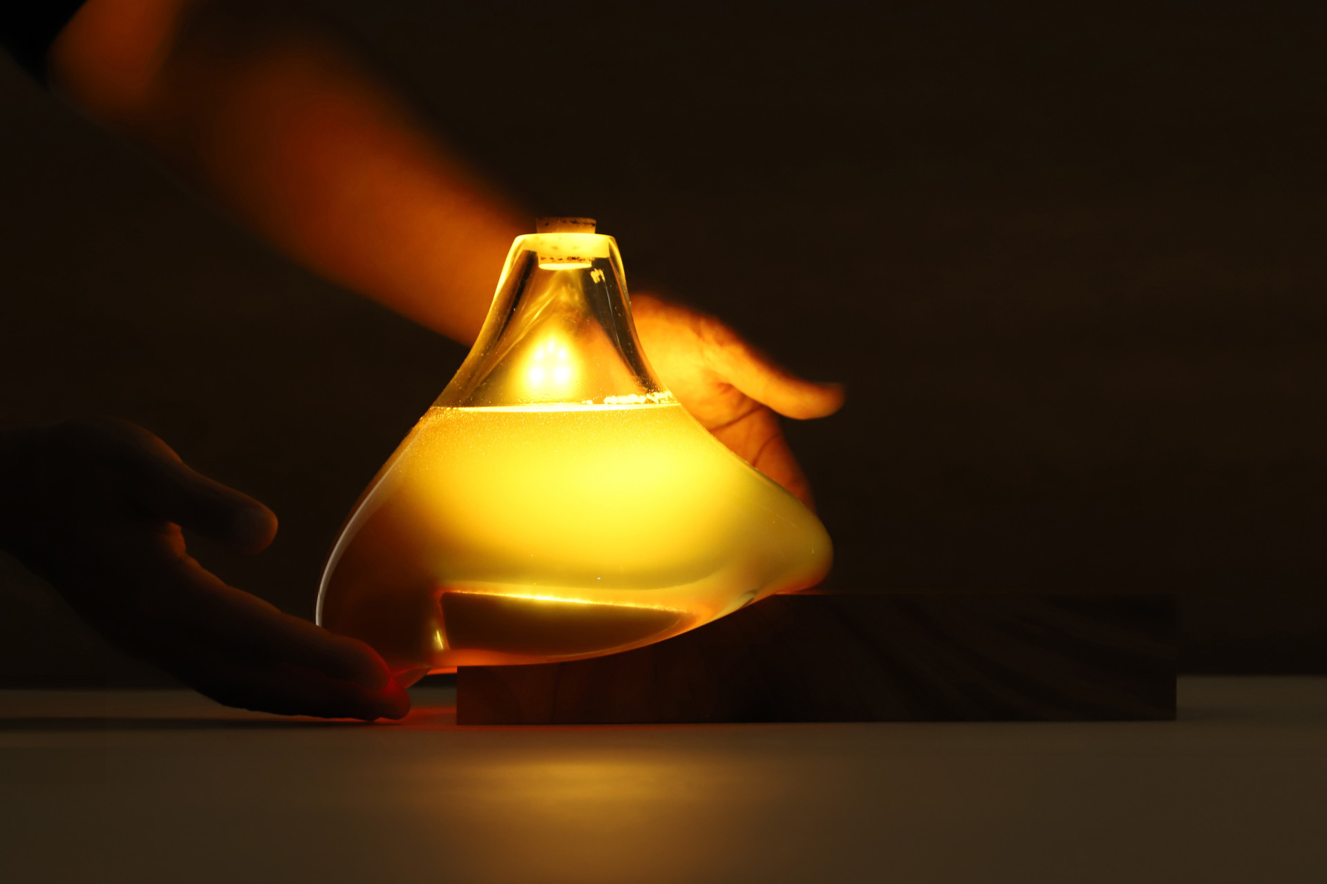
There is an immediate tension in this design, a poetic object that wants to function as a symbol of survival, yet risks romanticizing emergency itself. The honey inspired form, with its organic, droplet like geometry, is visually arresting and emotionally loaded, but this symbolism is both the strength and the potential failure of the product. It flirts dangerously with the idea that beauty can soften the harshness of disaster, a notion that, while seductive in theory, feels ungrounded in practice. The warmth of the light and the tactile seduction of the glass form do little to communicate urgency, clarity, or adaptability in an actual crisis. This is an object designed for peace disguised as a tool for peril, and therein lies the paradox. The metaphor of honey, nourishing, luminous, ancient, is clever, but it risks reducing the design to allegory rather than performance.
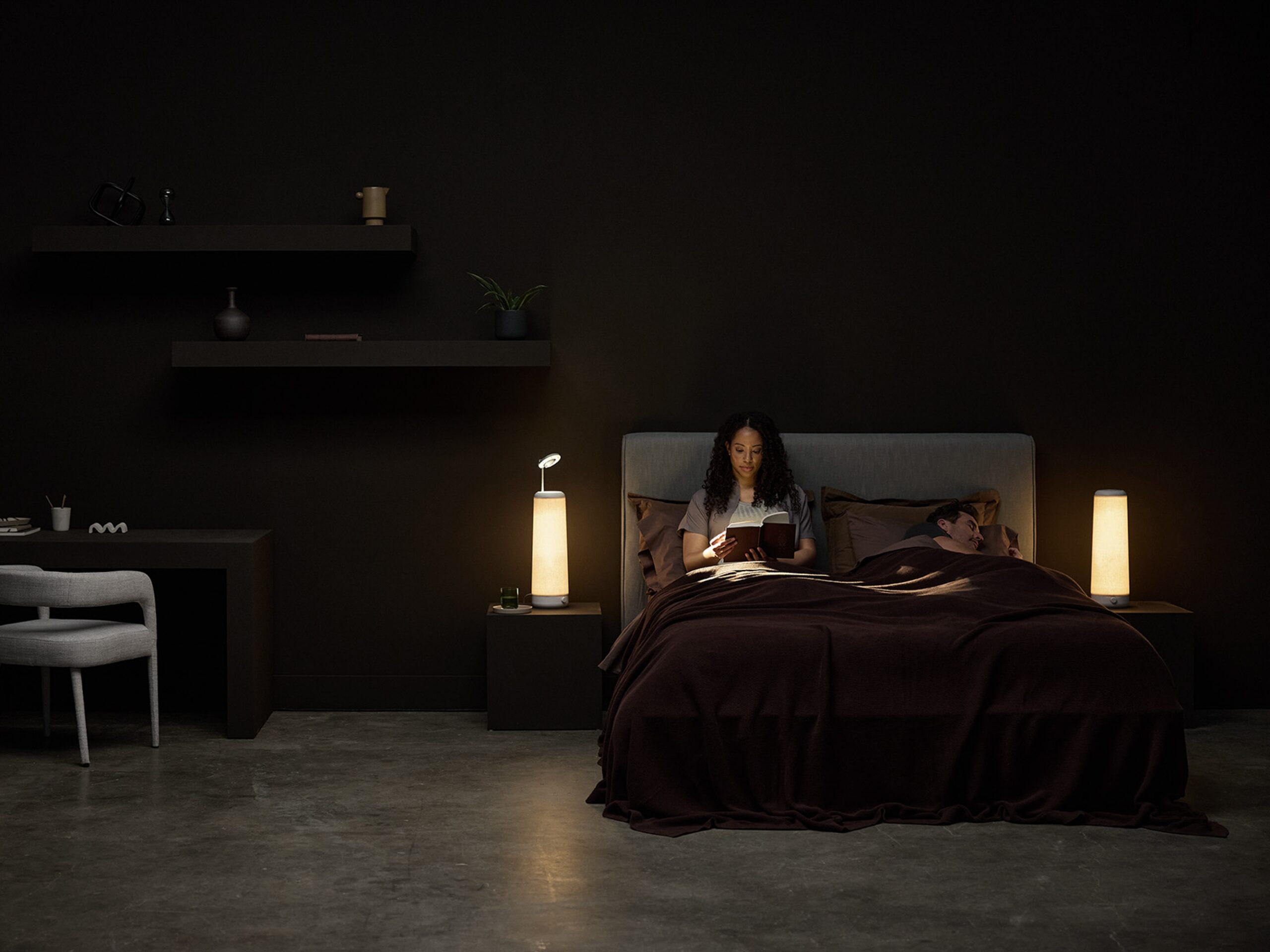
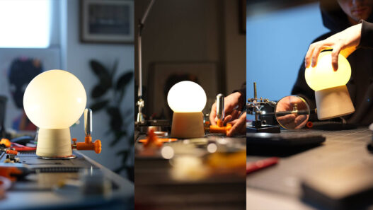
Functionally, the product attempts a dual purpose: domestic ambiance and emergency readiness. But the question remains, is it truly good at either? As a lamp, it offers soft, ambient light, but lacks adjustability, directionality, or versatility that contemporary lighting demands. As a preparedness object, it falls short of ruggedness or intuitive design cues necessary for high stress scenarios. Where is the grip? The seal? The failsafe mechanism? The LED base is elegant but subdued, almost too elegant for its claimed utility. This is not a device someone would instinctively reach for during a blackout, flood, or earthquake. The aesthetics have overtaken function, and while this may be forgiven in a sculpture or conceptual piece, it is less acceptable in a design that frames itself as life saving. 
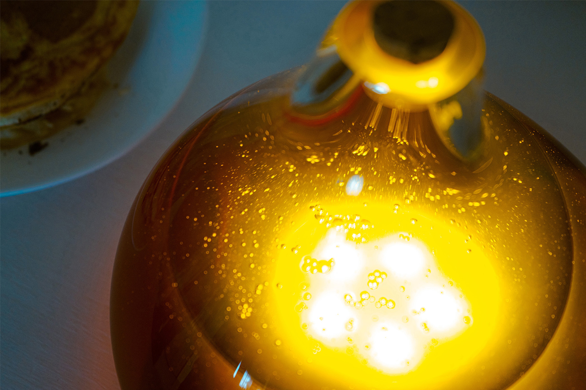
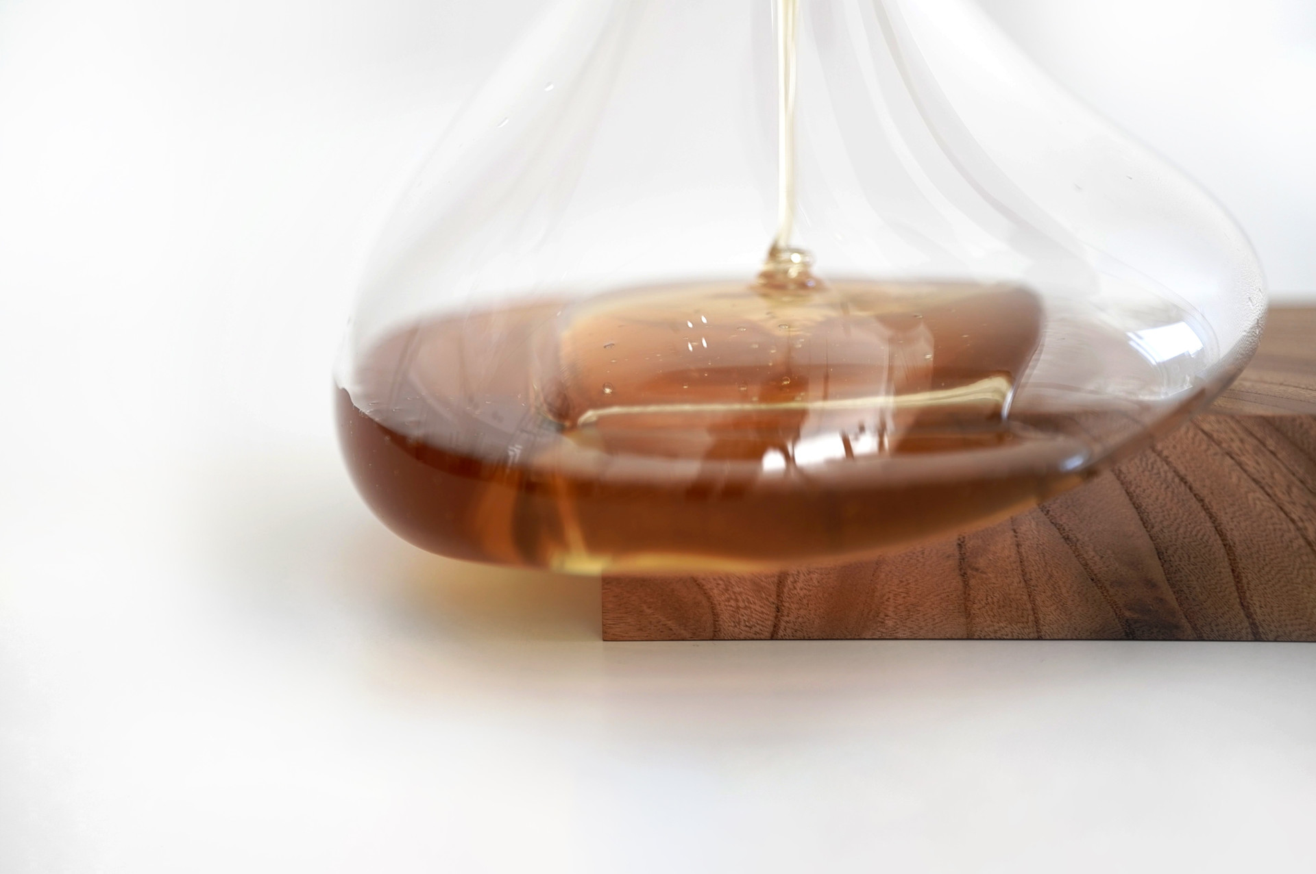
From a Gestalt and sensory perspective, the object succeeds on one level: it invites interaction, curiosity, and closeness. The transition from the luminous interior to the tactile exterior is seamless, and the warmth of the light echoes the viscosity of the honey it contains. However, the user experience is confined to contemplation, not action. There’s no behavioral depth, no modularity, no transformation, no affordance of choice. The base, though constructed from sustainably sourced wood, feels more like a platform for display than an active component of the system. Sustainability here is used as a moral garnish, not an integrated design ethic. The object appears self satisfied with its own symbolism, not interrogative or evolving, a static idea dressed as a dynamic solution.
The real inspiration behind this design seems to be less about honey per se and more about domesticating crisis, turning the concept of emergency into something soft, manageable, even aesthetically enjoyable. In that sense, the design most closely echoes the quiet, surreal duality of a Giorgio de Chirico painting: classical, dreamlike, yet oddly detached from reality. This lamp, like de Chirico’s arcades and statues, occupies a space between function and fiction, too poetic for pragmatism, too gentle for true preparedness. It seduces the viewer, but doesn’t empower the user.
Brand : Frame
Designer : Akira Nakagomi
Photo Credits : Takanori Urata
Prize: A’ Design Award